Elementor
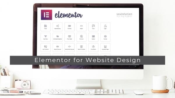
Benefits of using Elementor to create a beautifully designed soul-aligned webpages with ease for solopreneurs.


Benefits of using Elementor to create a beautifully designed soul-aligned webpages with ease for solopreneurs.
soulolution practical Quick Tips and Strategies that you can implement right away: SOUL Branding, Design, Communication and much more

Building a personal brand is crucial for establishing your identity, attracting and retaining customers, and ultimately growing your business.

Find a detailed list of free photo libraries available in the web for private and commercial brand design usage.
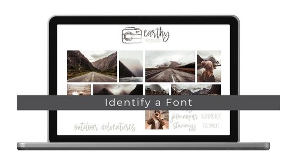
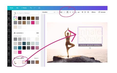
Read more on how to use a small tool to identify and name the exact fonts used on the websites you like so you can use them too.
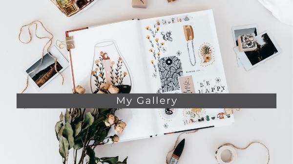
I started as an Art Director over 20 years ago and meanwhile have a broad portfolio and gallery of print and only Art I have designed. Find a selection here.
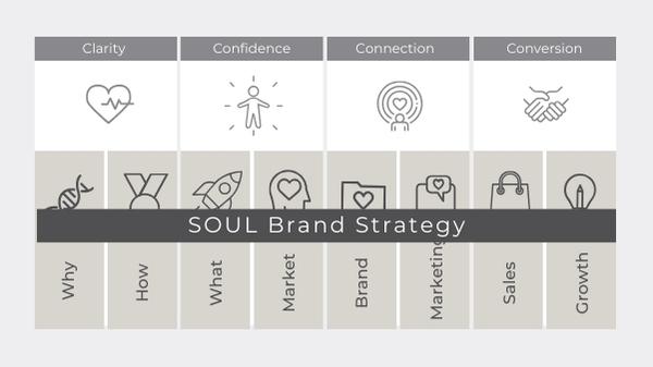
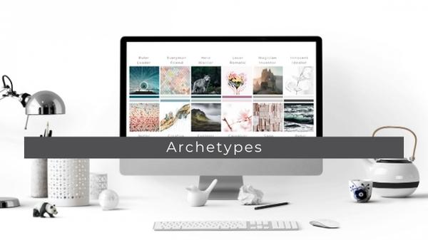
My SOUL Brand Identity framework will empower you to build a brand that captures your unique SOUL and authentically shares your story.A brand that takes your dream customer on a meaningful journey and converts them into a loyal advocate for you.
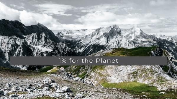
I’m driven by sustainability and support the 1% for the Planet Initiative: Putting people and the planet over profit.
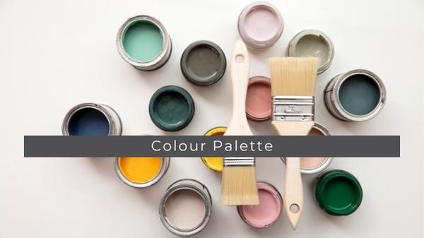
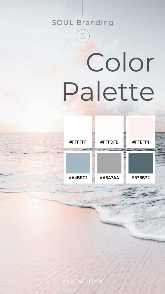
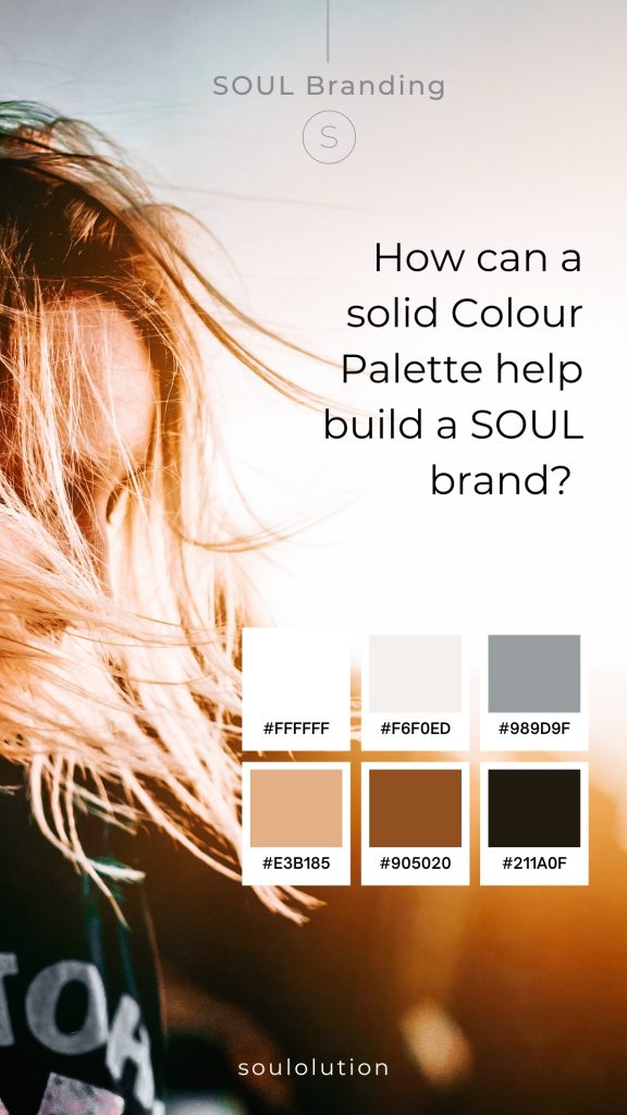
A good color palette can add value to a soul brand in several ways, according to the search results. Here are some key benefits.
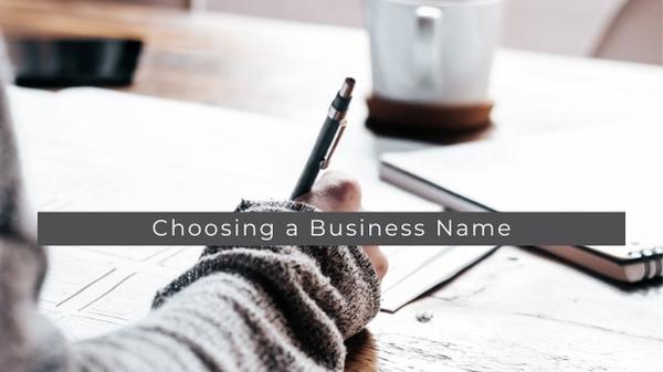
Tips and tricks for solopreneurs on how to find a unique, authentic, soul-aligned Busines Name for your Business.
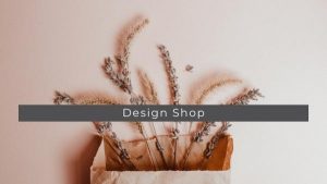
Brand Design Shop SOUL Brand Design Shop Easy editable SOUL Brand Bundles No waiting for designers – get access immediately!This totally editable Canva template is

Work with me SOUL Brand Design What I do With over 20 years of experience in design, branding, marketing, business strategy, leadership development, and with

Free Branding Library Free SOUL Brand Identity Library Welcome to my Free Branding Library, a page full of freebies designed to help small businesses thrive!

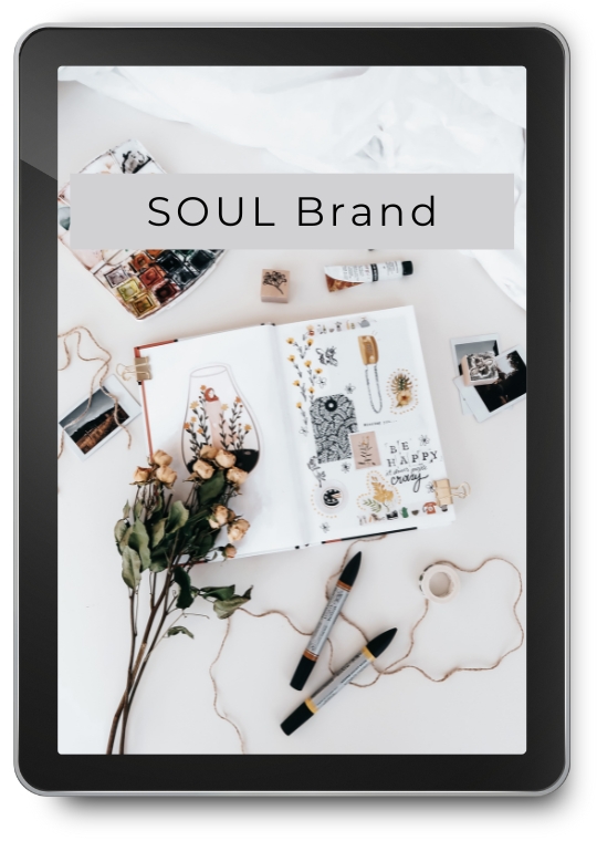
SOUL Branding Journal Welcome to my SOUL Branding Journal Here, I feature articles for solopreneurs and small businesses on design, branding, identity, and much more.

About soulolution – Susanne Merbold Hi I’m Susanne Merbold I am an independent Brand Strategist who is specialized in building impactful SOUL Brands for Rebels